BOSTON SCIENTIFIC
Streamline page layout with an emphasis on emotional and social resonance
ROLE
UI Design
RESPONSIBILITIES
UI Design, Cross-team Collaboration
TOOL
Sketch
OVERVIEW
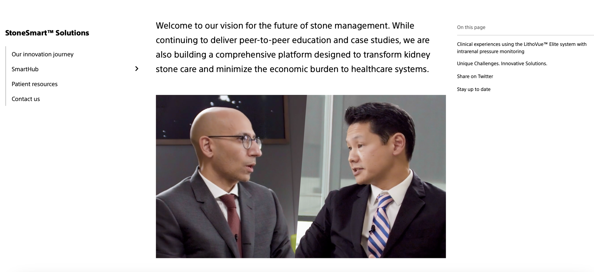
During a short term project with Boston Scientific, I spent several weeks mocking up layouts for their pages on urology, with an emphasis on integrating and highlighting a live social media feed.
PROBLEM
Clunky, technical page design that doesn’t highlight the “human” aspect.
Medical sites can often be intimidating to visit, bogged down in complicated terms, excessive links, and a general barrier to entry for understanding the content.
WHY IS THIS IMPORTANT?
Sites designed to inform a user on their condition or guide a user towards receiving care needs to be laid out in a way that is intuitive the user. If a user feels discouraged or confused, this could provide an obstacle in getting them the urgent help they needed.
SOLUTION
Streamline technical content and highlight the human aspect.
Coming into the project, some research had been gathered that would inform the designs. Namely, users had responded to seeing some of the principal figures behind Boston Scientific’s urology research - putting a name and face to a difficult topic. As such, we streamlined some of the content on the page to focus on fewer topics, highlight some of these figures, and include informative content.
USER SCENARIO CONSIDERATIONS
My aim was to create a user experience where content where the user is both informed of the medical issue they are going through as well as some of the cutting edge treatment offered at this site.

TECHNICAL CHALLENGE
How can we minimize user frustration when they feel lingering confusion and anxiety?
SOLUTION
Design the page to inform both on the subject and on further research
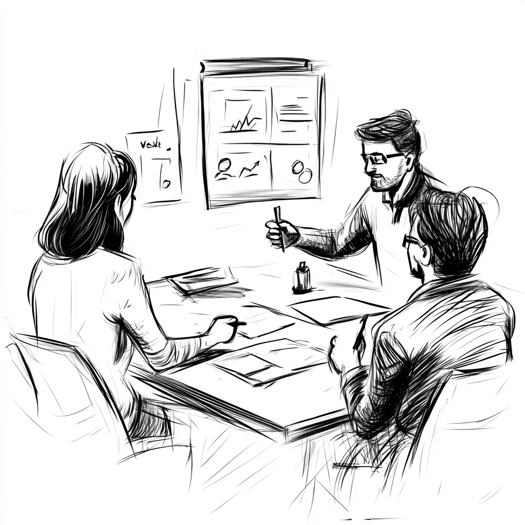
We set about defining key terms and concepts for this particular medical issue. In addition, we provided several Youtube videos embedded into the page. We had to factor in the users who may feel dissatisfied with these resources and would like to have options for further pursuing research. As such, contact and further outreach was prioritized on this page layout.
USER SCENARIO CONSIDERATIONS
Users have different levels of technical knowledge. They also have different levels of self-motivation. Some users are less motivated to go through existing resources and knowledge bases, they would rather hear more from an expert or someone versed in their issue.
RESULTS
Redesigned page launched for their site!
LEARNING
SOLUTION
It’s okay to pivot during design
Originally, the designs for this page cut out too much. We removed a lot of keyword terms and included a bit too navigation required to learn more. Not all users ended up exploring these options. We found a balance of informative content and streamlined navigation. In addition, we found after launch that the social media component wasn’t working as intended. The hashtags funneling into the live feed were vague and generally not the most useful in conveying specifics of the experience. We ended up removing that aspect and focusing on curating an experience around embedded videos and medical professionals.
On this pageOverviewProblem/SolutionUser challengeTechnical ChallengeResultLearning
USER CHALLENGE
How can we layout the page to guide the user’s learning experience?
SOLUTION
Reduce text and provide ample space for videos.
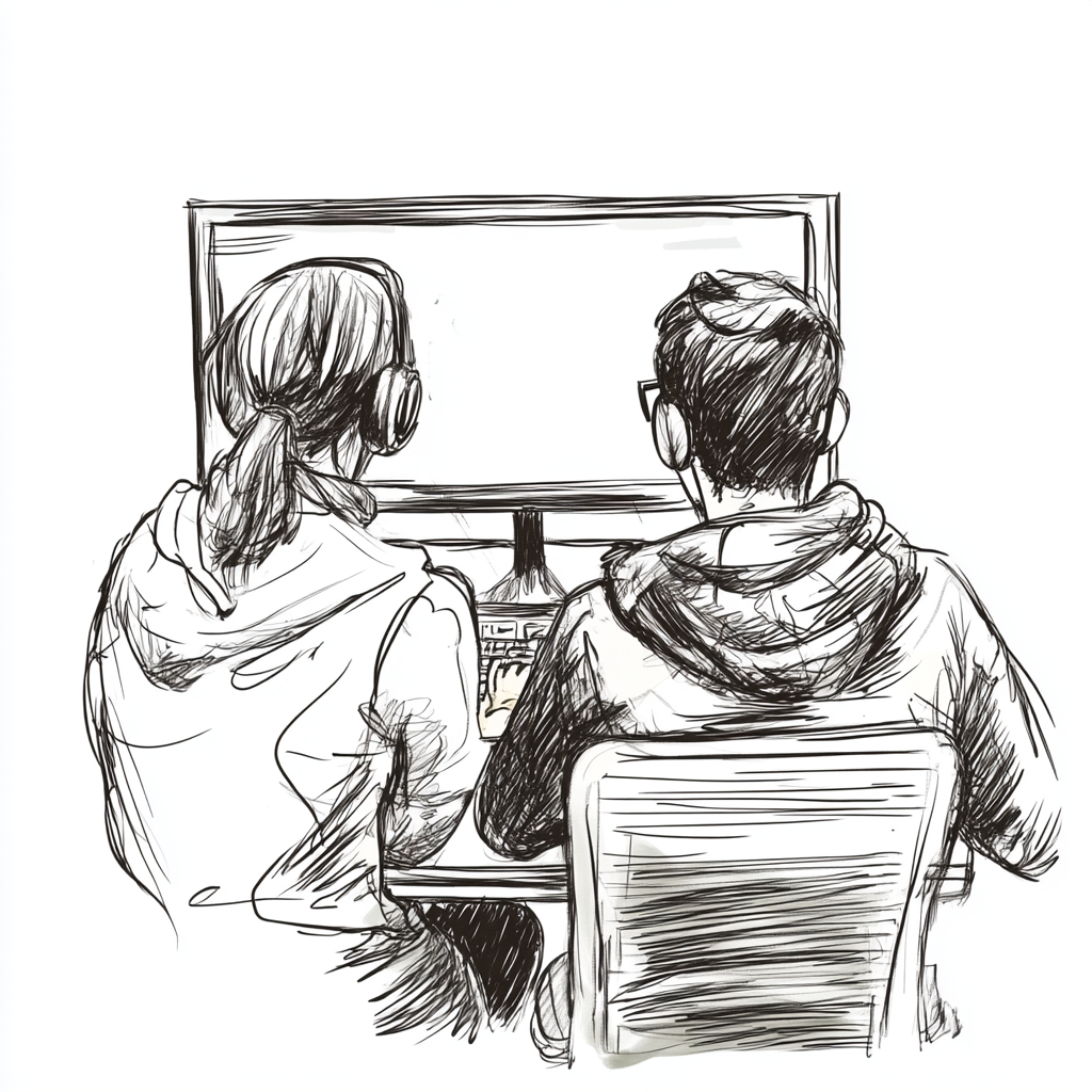
We removed a lot of the technical and more scientifically based wording from this page. We wanted to highlight several videos that would be able to answer users questions, as well as show a live social media feed that highlights users positive interactions.
USER SCENARIO CONSIDERATIONS
My aim was to create a user experience in which the users were given the tools they needed via clear, simple language, learning more about their condition, their providers, as well as experiences from users who went through a similar issue.