WESTERN ALLIANCE BANK
Develop and implement a design system for an internal and external facing investment software portal.
ROLE
UX Researcher,
UI Design
RESPONSIBILITIES
UI Design, UX Research, User Testing, Cross-team Collaboration
TOOL
Figma, DevOps, Agile

OVERVIEW
During my project working with Western Alliance Bancorporation (who I’ll call WAB), I led both an assessment of their current design system and led the development of a new design system. From here, we implemented the design in the total overhaul and re-design of their website, starting from low fidelity mock ups all the way through finalized wireframes handed to developers.
PROBLEM
Misuse of space, lack of “style” and modern look.
WAB’s recent work with their last agency had led to them being dissatisfied with both their produced pages and also on a fundamental level the design system provided to them. They defined success in terms of the aesthetics of their competitors, feeling these designs were outdated and behind the curve.
WHY IS THIS IMPORTANT?
This issue was a complicated one. Redesigning the entire design system, using that to produce new pages, and moreover producing new pages for two different internal and external facing sites was a huge undertaking. We had to first gauge whether anything was salvageable from their last collaboration.

SOLUTION
Research, interviews, and user and stakeholder testing.
First, I selected existing designs and walked the current users and stakeholders through. Identifying which elements they liked, I also did a competitive analysis of other banking companies. The look and feel had to use certain brand standards, but outside of that there was largely free rein. We demo’d several interactive components that could be extrapolated into a larger design system should they satisfy both user and stakeholder.
USER SCENARIO CONSIDERATIONS
For this project, we had two sets of users: internal stakeholders who needed tools for user management and external users who would use the portal to management investments and deals. This meant that we needed to have a flexible design system that could accommodate subtle changes across page layouts depending on the type of user accessing the site.

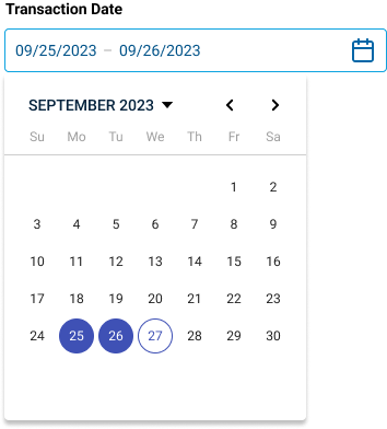
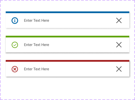
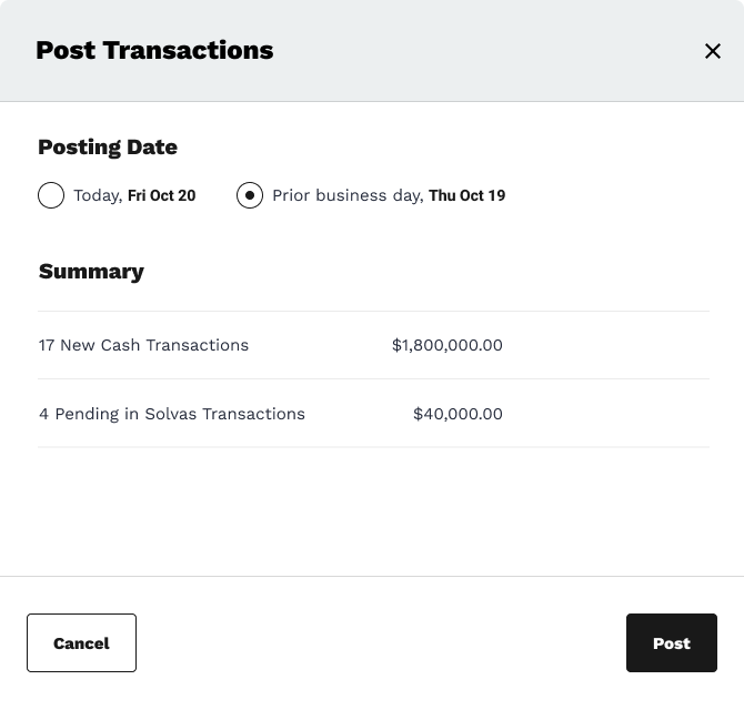
Example Demo’d Components


USER CHALLENGE
How can we condense information and tools without inhibiting user navigation?
SOLUTION
User testing through developer capacity.
The client had grand ambitions for a streamlined, modern, and functional approach. Some of our components above were on the right track, but overall the look and feel wasn’t “quite right”. As we worked to achieve these goals, we also realized we needed to produce designs for our developers to begin working on. As such, we needed to balance the desires of our clients with small wins we can leverage for our developers.
USER SCENARIO CONSIDERATIONS
Users as stakeholders can be both a blessing and a curse. They sometimes can conflate their dual purpose as being a designer as well. Here we needed to clearly lay out best practices and recommendations, leveraging out expertise to ensure the stakeholders don’t design their own solutions they’ll engage with as users…while also balancing the subject expertise they have.

TECHNICAL CHALLENGE
How can we create a new design system and site within a limited time frame?
SOLUTION
Reusable, modern components that can be reused across the site.
We took a modular approach to design that allowed for components to be developed as broader pages were designed. By working in tandem, we were able to meet very tight deadlines for a client who often had issues down to the pixel with spacing, font, etc.
USER SCENARIO CONSIDERATIONS
Given the information density on this page, we had to balance multiple components across a single page. As such, we needed to use tooltips, drawers, dropdowns, a lot of techniques to present content without absorbing space. This also made it simpler to design both an external facing portal as well as an internal one. The layout allowed the room for visual cues and tools for admins to be laid out elegantly.

RESULTS
Design system and redesign launched across the company!


LEARNING
SOLUTION
Leverage expertise and dual workflows to establish a transparent line of communication with a client.
The client came in with a clear idea of what they wanted but a murky vision of how to get there. Given our extensive requirements for success, we had to overcommunicate in the beginning with the client, whittling down an MVP as well as a visual and aesthetic direction. We needed to develop an approach where developers weren’t left twiddling their thumbs and instead were able to be productive even if entire pages weren’t ready to be designed. We needed an active aspect of UX research throughout, meeting constantly with users and stakeholders to get responsive feedback that informed the design system and overall page layout.
On this pageOverviewProblem/SolutionUser challengeTechnical ChallengeResultLearning